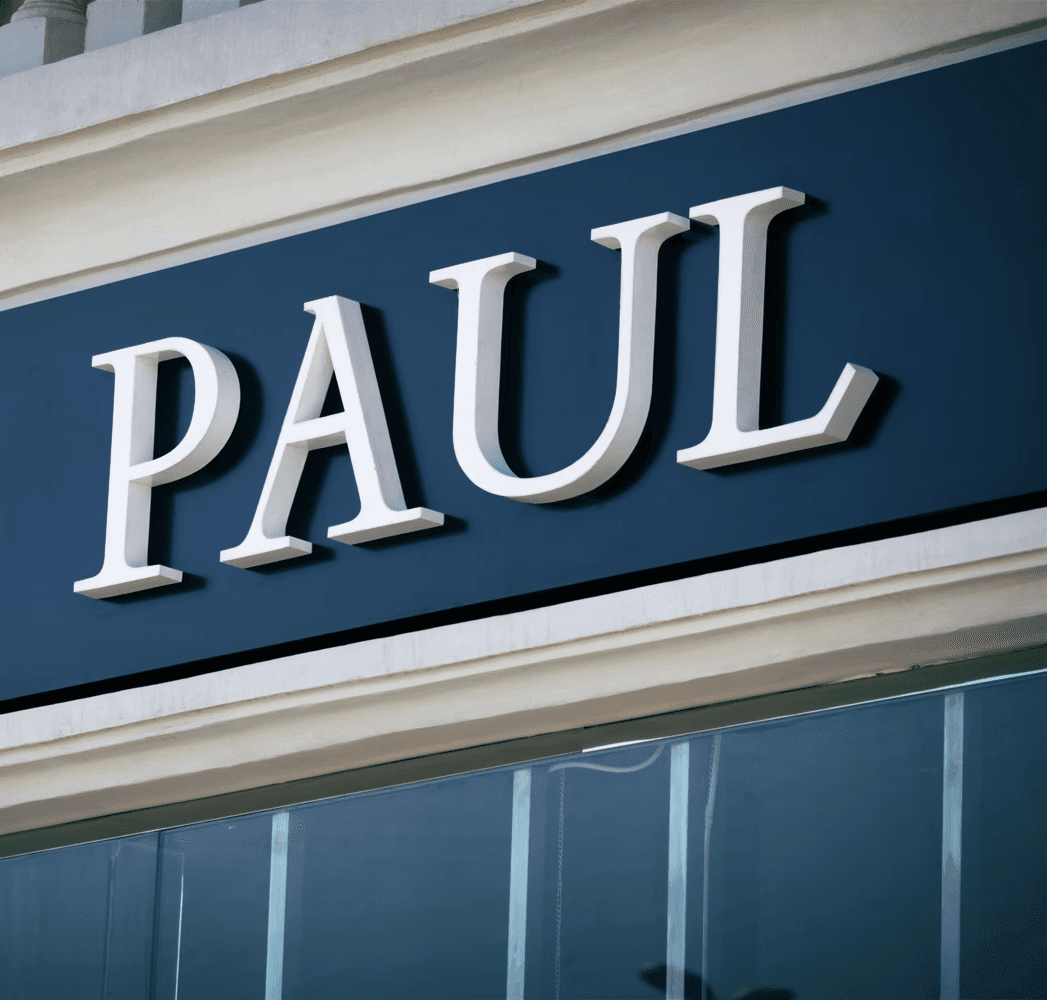
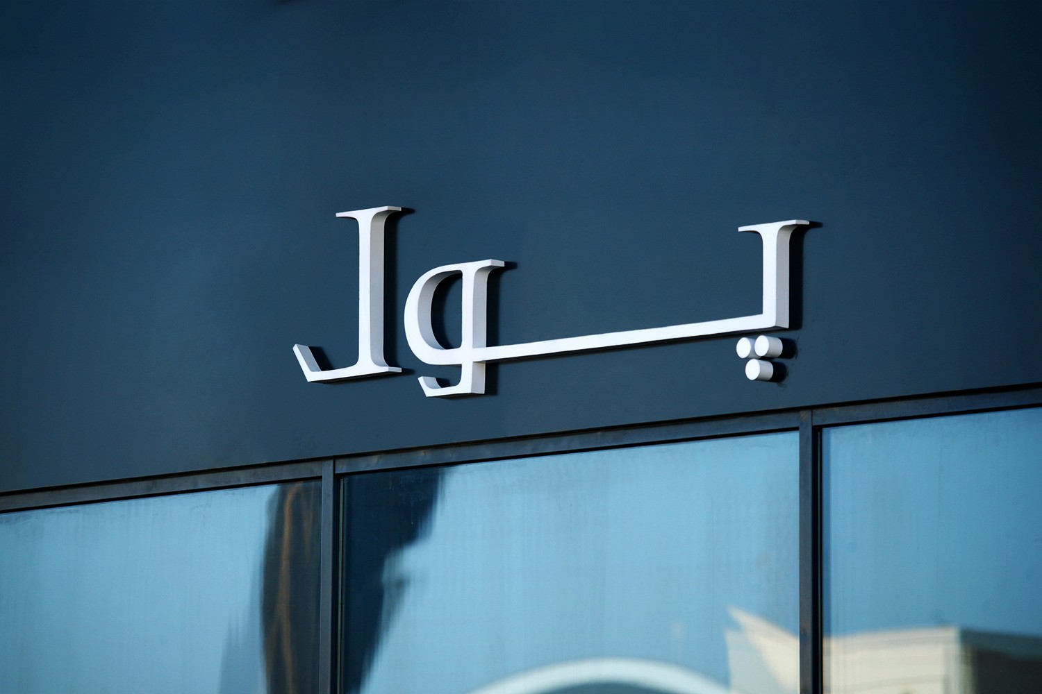
Bridging Cultures Through Typography
For PAUL restaurant’s expansion into the Middle East market, the project focused on developing an Arabic font that harmonizes seamlessly with the existing English typography. The goal was to create a professional and culturally appropriate visual identity that reflects PAUL’s global reputation while appealing to the local audience.
A Unified and Professional Brand Identity
The result was a custom-designed Arabic font that aligns with PAUL's English typography, maintaining a consistent brand appearance across both languages. This typographic enhancement ensures that PAUL's brand communicates sophistication and professionalism as it expands its presence in the Middle East.